A name centered on a coaster is not necessarily misplaced because a cup covers it. It may be intended for display, for giving, or for the moment the drink is lifted. But if the purpose is to identify a guest while the drink remains in place, the same composition may miss its goal.
Design laser engraved coasters in two states: empty and occupied. Decide what the artwork should communicate in each, then compare the intended cup with the actual usable face before committing the design to the material.
Decide When the Message Should Be Seen
A coaster can carry different kinds of personalization. A family name might be the main feature when the set is stacked or displayed. A short guest identifier might need to remain visible beside a glass. A concealed message can deliberately become a small discovery when someone lifts their drink.
These purposes lead to different placement choices.
A centered monogram can give an empty coaster a balanced composition without needing to remain visible during use. A peripheral identifier can serve the occupied view, provided there is enough space to read it comfortably. A split design can combine a central motif with a shorter name or initial near the edge.
Choose that hierarchy before filling the surface with decoration. Otherwise, the name may end up squeezed into whatever narrow strip remains outside the cup, even though it was meant to be the most useful element.

Compare the Cup’s Coverage With the Usable Face
The cup’s contact ring is not the same as the area it visually conceals. A vessel may touch the coaster through a relatively narrow base while its wider body hides more of the artwork when viewed from above or across a table.
Use the intended vessels when assessing coverage. Consider a hypothetical set of laser engraved Christmas gifts: one household may usually use broad mugs while another uses narrow glasses. An identical centered design could be covered differently in those two settings. That does not make either layout wrong; it changes whether the artwork meets the chosen purpose.
Clear glass is not a guarantee that wording beneath it remains readable. The drink, glass shape, and viewing direction can change the view. Judge the actual composition rather than assuming transparency makes placement irrelevant.
The coaster’s outside dimensions are not necessarily its available art area either. A bevel, lip, decorative border, or irregular edge can reduce the face that comfortably accepts lettering. Not every coaster has those features, so inspect the selected blanks rather than designing from a generic circle or square.
Handle position can also affect visual balance. A mug placed with its handle to one side may make a peripheral name feel differently positioned from the same name beneath a handle. This is a composition question, not a prescribed clearance rule.
Preserve Readability Instead of Filling Every Gap
An edge layout is useful only if the message remains readable. Moving a long name around a narrow rim can produce tiny lettering or a reading direction that feels awkward.
Sometimes the better choice is less text: an initial, a first name, or a concise identifier instead of a full dedication. The longer message can remain central and be revealed when the cup is lifted. Circular lettering is another option, but it changes the available arc length and the direction in which the viewer reads.
For a square coaster, a short line along one edge may establish a clear front. For a round coaster, an arc can suit the outline, but the design should still have an intended orientation. Do not assume a name remains equally legible after the coaster is rotated.
Check the real font and surface together. Fine strokes, textured backgrounds, grain, and engraved contrast can change what remains distinguishable. There is no universal font size or edge offset that resolves those variables for every coaster.
Make the Set Related Without Making Every Name Identical
A coordinated set does not require every name to occupy exactly the same width. Shared border weight, motif family, alignment, or placement can establish a common visual language while accommodating different lettering.
Avoid automatically enlarging every short name and shrinking every long one. That can give each coaster a different visual emphasis. Equally, insisting on one font size may force a longer name into the cup’s covered area or beyond the useful face.
Choose what should remain consistent. If the purpose is guest identification, a common peripheral location may matter more than matching text widths. If the set is intended mainly as a displayed gift, a consistent central composition may be more important.
In the hypothetical broad-mug household, a central message with a deliberately separate short identifier could serve both views. For the narrow-glass household, a central motif may remain partly visible, but it should still be assessed with the intended glasses rather than assumed to work.
Check Composition Before Production Positioning
A full-size representation placed beneath the actual vessel is a useful way to judge coverage. Look at the occupied arrangement from the intended viewing direction, then remove the cup and assess whether the empty design still feels complete.
This does not establish stability, heat resistance, moisture performance, or material durability. It answers the narrower question of what the composition communicates.
Production positioning is separate. Epilog’s cork-coaster project distinguishes artwork guidelines from a placement jig used to locate its particular coasters. Its CO₂ equipment and settings belong to that project, not to another machine or material. For the separate issue of positioning naturally variable slate blanks, see centering slate coaster artwork with a jig that allows natural variation.
Leave sensible visual room for the actual face variation rather than extending an elaborate border to an assumed perfect edge. That is a layout decision; it is not a substitute for a suitable production setup.
Confirm the Artwork on the Selected Material
Once the empty and occupied compositions agree with the purpose, evaluate the accepted artwork on identified, suitable material. For a project considered on the TwoTrees TTS-20 Pro laser engraver, assess the identified stock and its surface treatment against the documented setup. A product illustration or machine specification alone cannot qualify an unknown binder or coating.
Confirm the substrate and coatings before processing; Trotec warns that some compositions generate hazardous gases or dust. Follow the exact machine’s guarding, protection, and extraction requirements, and never leave an operating laser unattended.
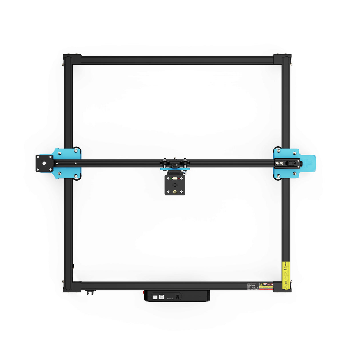
A representative material sample can show whether the chosen lettering and motif remain readable under the actual process. It does not prove waterproofing, heat resistance, food-contact suitability, or long-term durability.
If identification during use is the priority, preserve a readable area outside the intended vessel’s coverage—even if that means shortening the message. If the message is meant to appear when the cup is lifted, let the center carry it confidently. The successful design is the one whose placement serves its purpose in both views, not the one that keeps every engraved mark visible all the time.