Retyping a handwritten message preserves its words, but not the writer’s handwriting. The spacing, joins, uneven baseline, and distinctive letter shapes belong to the original marks. A handwriting-style font replaces those features with someone else’s alphabet.
For laser engraved handwriting, keep an untouched source, decide which marks belong in the keepsake, and compare every prepared version against that source at the intended physical size. The goal is fidelity, not simply cleaner-looking text.
Preserve the Writing Before Improving Its Appearance
Keep the original scan or photograph separate from an editable copy. This gives you a reference when deciding whether a small mark is unwanted background or part of the message.
Seek a clear capture in which the writing is readable, without treating a fragile original as a craft material. Blur, glare, folds, or obscured ink can leave genuine uncertainty. Increasing resolution, smoothing a trace, or using an AI reconstruction does not establish what the writer originally put on the page.
Optical character recognition (OCR) and transcription identify the words in a note. They can help create a separate caption or reading copy, but they do not retain the original letterforms. If a word cannot be read confidently, do not silently invent it and present the result as preserved handwriting.
An excerpt can be more faithful than a compressed whole page. Choose it deliberately, allowing room for the salutation, date, or surrounding context you want to retain. Avoid clipping a crossbar, a dot, or a connecting stroke merely to make the composition fit.
If you add a new date, dedication, or typeset explanation, make it visually separate from the source. Personalization can accompany the handwriting without pretending that the original writer supplied the new text.

Remove Background Without Removing Meaning
Imagine a hypothetical short holiday note containing a faint dot, a crossing stroke, and a dark paper speck in an otherwise blank margin.
Removing the margin speck is a background-cleanup decision. Removing the faint dot may change punctuation or a letter. Joining a gap near the crossing stroke may change the shape that makes the writing recognizable. Similar-sized marks can therefore deserve different treatment.
Compare the prepared artwork with the source rather than applying one rule to every small feature. Look at familiar letter shapes, spacing, open areas within letters, punctuation, and corrections. An uneven join or a slightly awkward curve may be part of the writer’s character, not a defect to polish away.
Decide whether the keepsake represents the writing alone or the appearance of the whole document. A stain outside the message may be irrelevant to a clean excerpt, while the same stain may belong in a deliberate reproduction of the page. Keep that decision separate from guessing whether a faint mark is a letter. When a mark remains ambiguous, retaining the source reference is more honest than silently replacing it with a confident new shape.
A Trace Is a Representation, Not Recovered Penmanship
Vector conversion can make artwork editable, but it remains an approximation. LightBurn’s current Trace Image documentation distinguishes standard boundary tracing from Center Line Trace: one follows the edges of a mark, while the other follows its center. Sketch Trace addresses unevenly lit page photographs through local contrast. Available options depend on the installed version.
Those representations can produce different appearances. A boundary trace assigned only to a line operation may outline the ink rather than reproduce a solid handwritten stroke. A centerline does not recover pen pressure, stroke order, or the original ink width. Choose the documented output operation for the appearance you intend.
Automatic cleanup also deserves scrutiny. LightBurn notes that small-area removal can discard details and excessive optimization can reduce accuracy. Its documentation recommends considering the original image in Threshold Image Mode when tracing fails to preserve fine features. Vectorization is therefore an option rather than a requirement for faithful handwriting. The separate guide to raster, vector and fill operations explains the broader file-versus-processing distinction.
For the hypothetical note, compare whether the faint dot survives, whether the crossing stroke remains distinct, and whether small gaps remain open. A smoother result is not necessarily a more faithful one.
Judge the Writing at the Finished Size
Large on-screen artwork can hide problems that appear when the message becomes a small keepsake. Thin marks may become difficult to distinguish, closely spaced strokes may merge visually, and open areas within letters may appear closed.
Assess the intended physical size and reading distance. If the full note becomes cramped, increasing the object size or choosing a shorter excerpt may preserve more of its character than thickening every stroke.
Thickening, redrawing, or regularizing the writing can be a legitimate aesthetic choice. It should be understood as an adaptation, however—not described as recovered original handwriting. The same applies to replacing an illegible word with typeset text: keep that editorial addition distinct.
When planning laser engraved Christmas gifts, a brief original sign-off may communicate more than a whole page reduced beyond comfortable reading. The decision should follow the selected source and its purpose, not an arbitrary character limit.
Let the Material Sample Test the Prepared Artwork
The accepted digital representation still needs to remain readable on the chosen surface. Material color, grain, and the resulting contrast can change which details stand out.
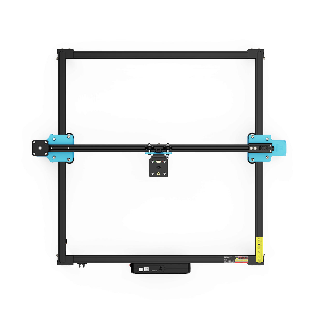
For a flat keepsake considered on the TwoTrees TTS-20 Pro laser engraver, move from the accepted artwork to the actual substrate and documented process. The digital image, chosen output operation and physical surface all contribute to what appears. A machine specification alone cannot establish which faint strokes will remain distinguishable.
Use a representative suitable-material sample containing the features that matter: a distinctive join, a faint mark, and a small open gap. Compare the result with the accepted artwork. If those features disappear or merge, revise the scale, representation, or documented process rather than assuming the original letterforms must be redrawn.
Confirm the substrate and coatings before processing. Unknown materials are not approved by their appearance; Trotec identifies compositions that can release hazardous gases or dust. Follow the exact machine’s guarding, protection, and extraction requirements, and never leave an operating laser unattended.
The keepsake is ready when the chosen marks remain recognizable at their finished size and the material rendering supports the accepted artwork. Preserve what the source actually shows, distinguish any additions, and leave uncertain writing uncertain rather than polishing it into something the writer never wrote.